Zoosync
helping zookeepers with daily care and emergencies
Zoo-Keepers?
What's is this?
ZooSync is a mobile app concept for zookeepers who need to juggle daily tasks, animal health records, and emergencies while spending most of their time on their feet. The goal was to design something that supports keepers while they’re actively working — not something that pulls them away from the animals.
This was a collaborative team project focused on complex, real-world workflows.

The key "problem"
Zookeepers are responsible for feeding, enrichment, health checks, documentation, and emergency response across multiple enclosures. A lot of this work still relies on manual logging or clunky systems, which means time spent writing things down instead of paying attention to the animals.
We wanted to understand how a digital tool could fit into that reality without getting in the way.
What we did.
This project was completed with Dasha Orlov, Farrel Sudrajat, Joy Yao, and Tam Tran.
My main contribution was shaping the direction of the project early on and carrying it through to the final design.
- Proposed focusing the project specifically on zookeepers and their workflows, which became the foundation for the concept.
- Became a key organizer, helping structure the research, define priorities, and keep the project moving as we narrowed scope.
- Designed the final interface for the interaction flows, translating the research and strategy into the finished screens.
The work was collaborative throughout, but I took primary ownership of the product direction and final UI.
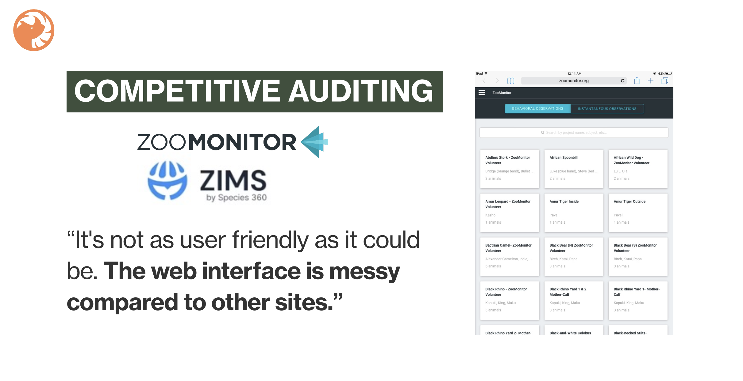
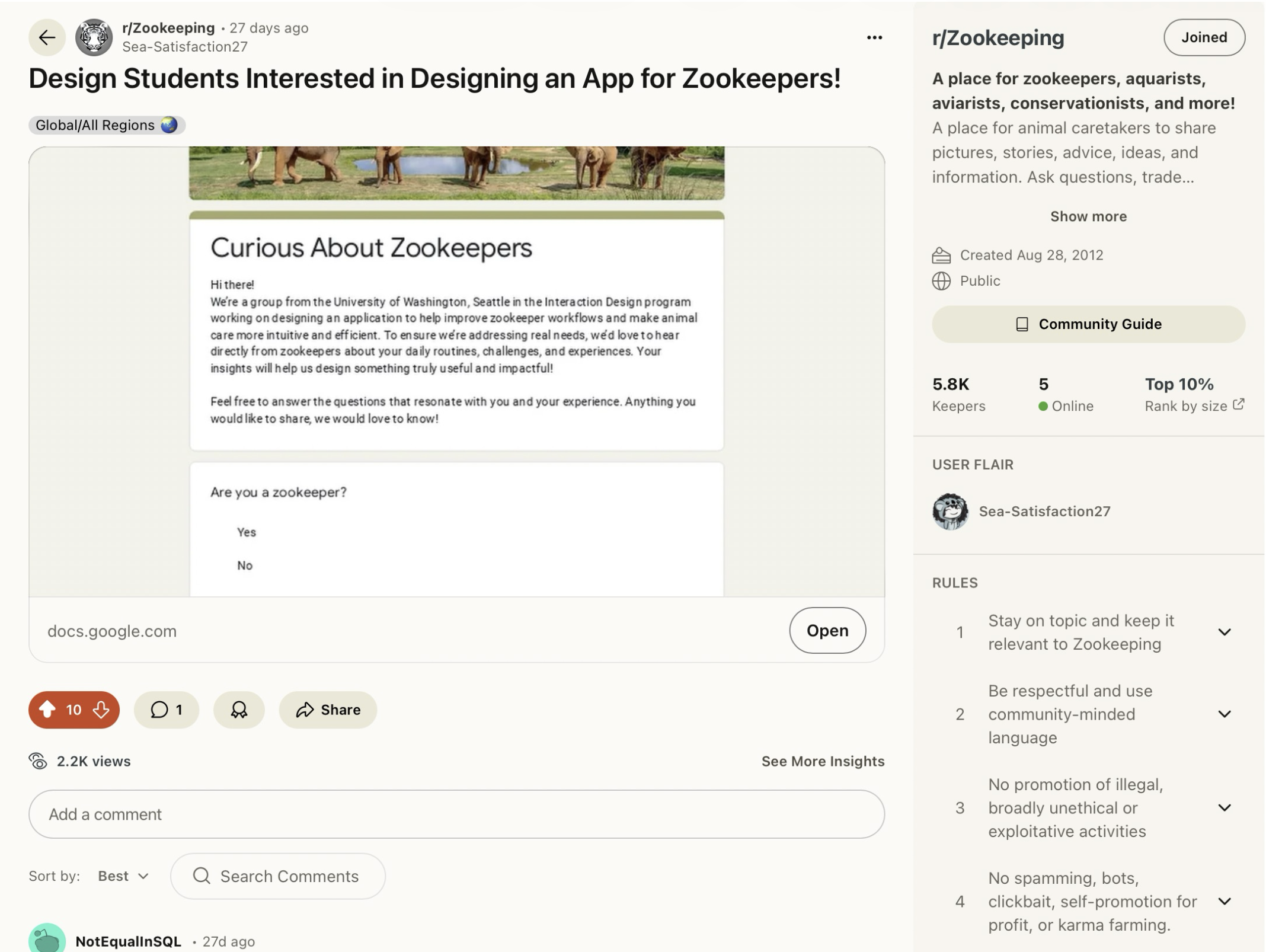
Research.
To ground the project in reality, we started with research into what zookeepers actually do day to day and where existing tools fall short.
This included:
- Looking at daily schedules, responsibilities, and physical constraints of zoo work
- Researching existing zoo management tools and related industries
- Collecting survey responses from working zookeepers to understand pain points
- Identifying patterns around time pressure, safety, and information overload
These insights helped us avoid designing something overly idealized or unrealistic.
Solution
Defining the direction.
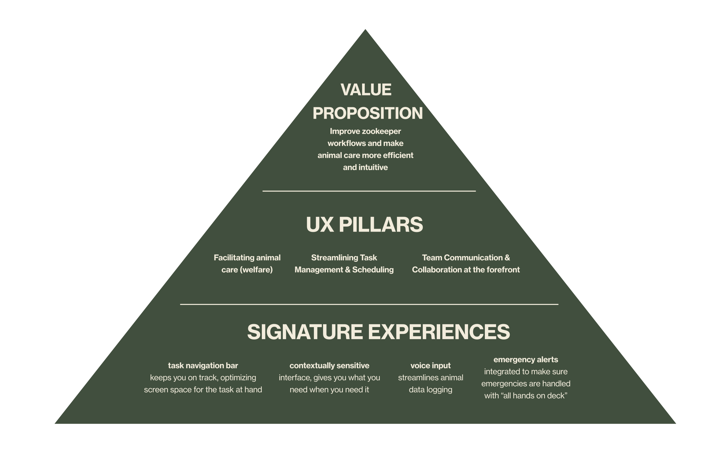
Based on research, we clarified what mattered most for this tool.
We used a product pyramid to prioritize:
- Supporting animal care and welfare first
- Reducing time spent logging and searching for information
- Making sure critical updates and emergencies are impossible to miss
This helped us stay focused as the system became more complex.
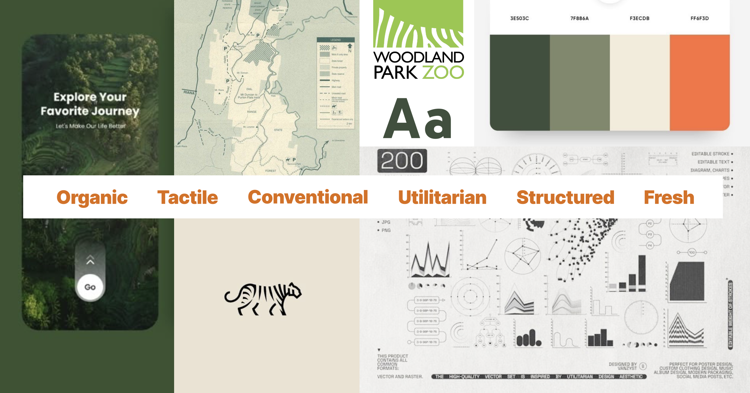

Visual direction & style.
The visual system was designed to feel calm, clear, and durable — something that could be used throughout a long workday.
The style guide focused on:
- High contrast and legibility
- Simple layouts that don’t compete with content
- A visual tone that feels practical rather than polished or decorative
These decisions supported the overall goal of keeping attention on the animals, not the interface.
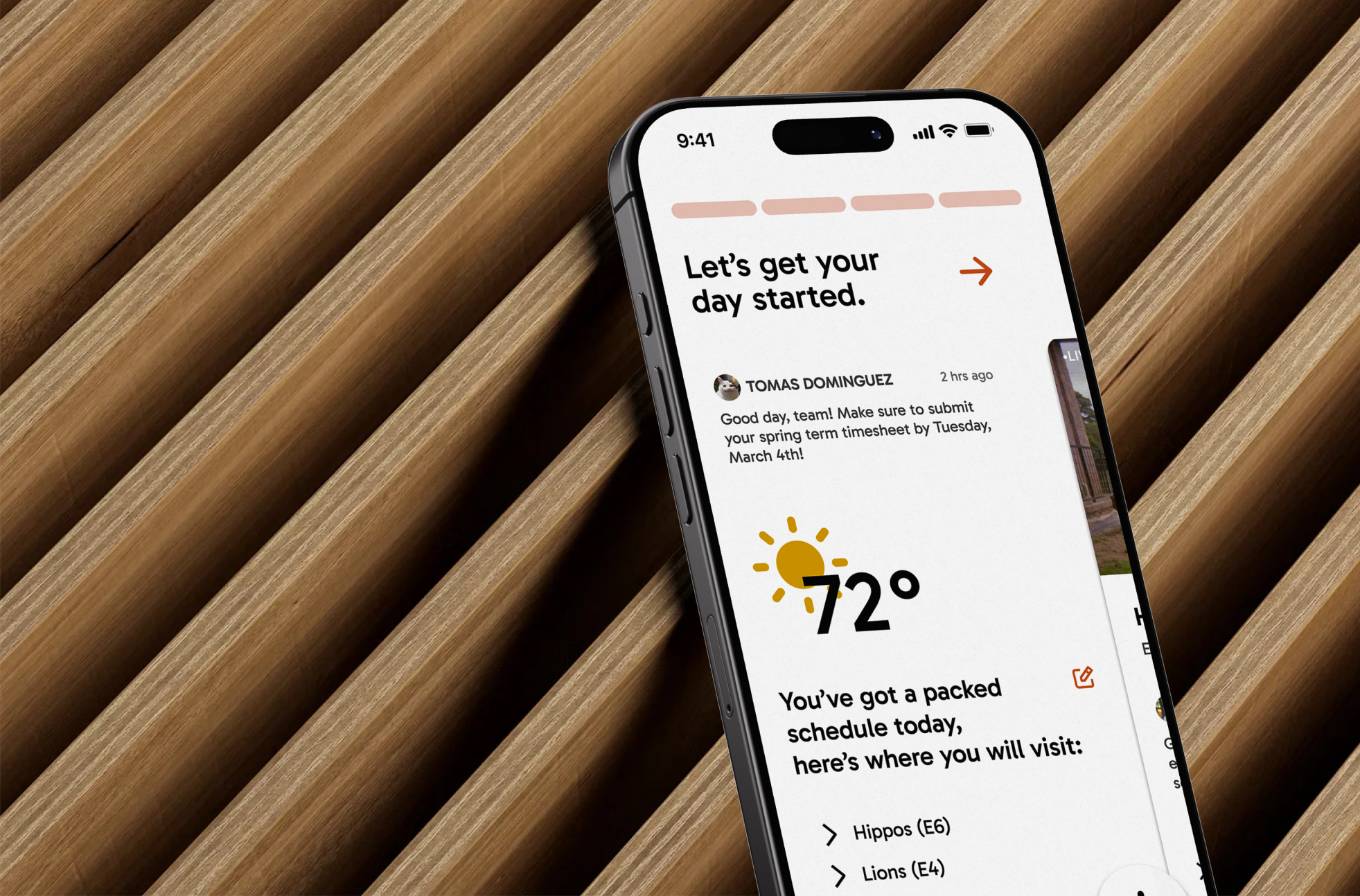
The final design.
The final design brings together research, structure, and visual decisions into a single system.
Key parts of the product include:
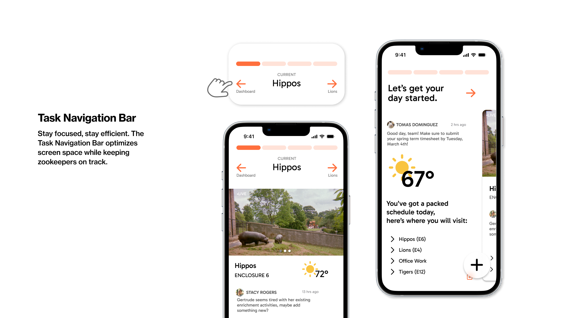
- A daily overview that helps keepers understand what needs attention
- Task-based navigation that adapts to what they’re working on
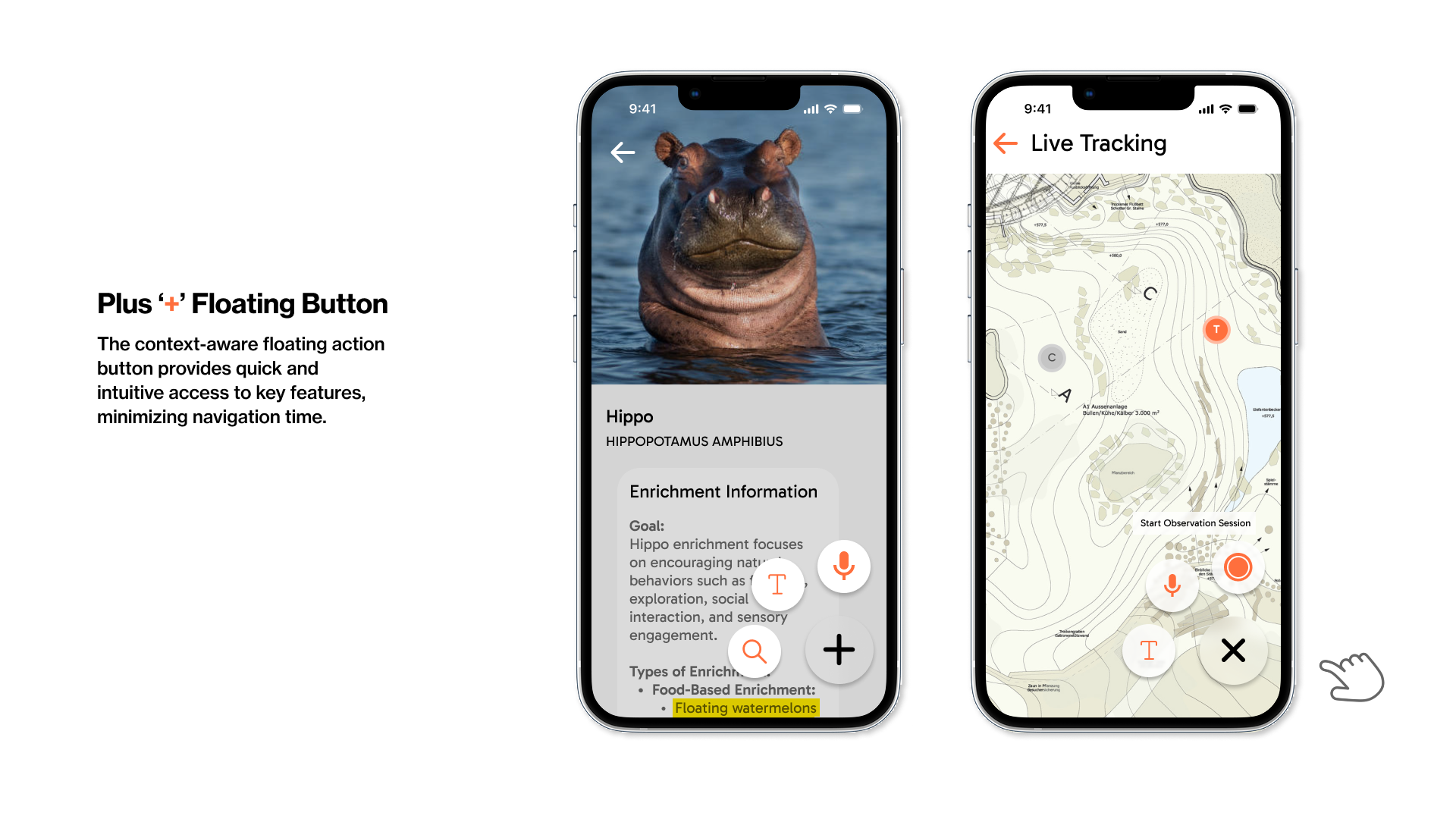
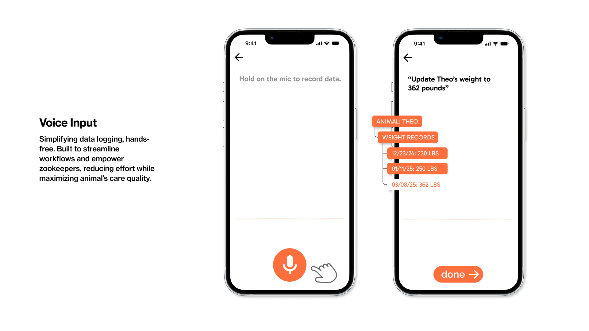
- Voice input for logging observations without stopping work
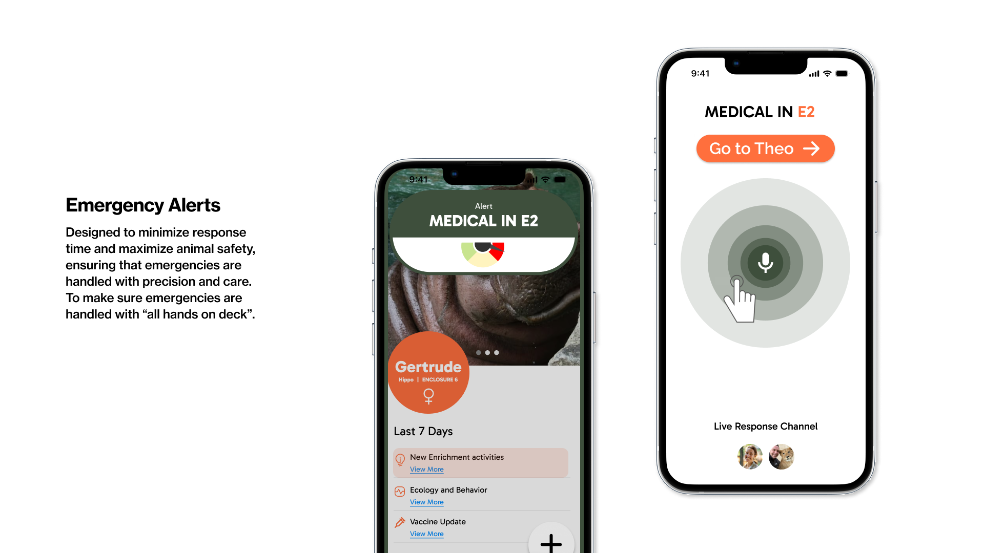
- Emergency alerts that cut through everything else when needed
- Animal profiles that keep relevant information in one place
The interface is intentionally straightforward, built to work in busy, sometimes stressful situations.

Reflecting
Feeling proud and having had fun.
ZooSync shows how I approach larger design problems: starting with people and context, organizing complexity, and carrying ideas through to a finished product.
If this project were taken further, it would need direct testing with zoo staff and integration with existing record systems. Still, it represents how I think about designing tools for real work, not just ideal scenarios.